Q1. Two dice were tossed 100 times. The total points of each toss are represented in the histogram below:
 Use the histogram to answer each of the following question.
a. Which outcome happened the most times?
b. How many times did this outcome discussed in part a happen?
c. How many rolls had a total of less than 6 points?
d. How many rolls had a total of 10 or more points?
Use the histogram to answer each of the following question.
a. Which outcome happened the most times?
b. How many times did this outcome discussed in part a happen?
c. How many rolls had a total of less than 6 points?
d. How many rolls had a total of 10 or more points?
Use the histogram to answer each of the following question.
a. Which outcome happened the most times?
b. How many times did this outcome discussed in part a happen?
c. How many rolls had a total of less than 6 points?
d. How many rolls had a total of 10 or more points? Solution
a. The frequency of bar for 7 points is the highest. Hence, 7 points
b. The bar for 7 points has the frequency equal to 17. Hence, the outcome of 7 points happened 17 times.
c. The number of rolls less than 6 points is found by adding the frequencies for the groups of 2 points, 3 points, 4 points and 5 points.
Required number=2+6+13+11 = 32
d. The number of rolls 10 or more than 10 points is found by adding the frequencies for the groups of 10 points, 11points and 12 points.
Required number=7+5+2 = 14
Q2. The following table shows the number of visitors to a park for the months January to March.
Month
January
February
March
No. of Visitors
150
300
250
a) Construct a bar graph representing the given data.
b) What is the percentage increase in visitors in March as compared to January?
c) What percentage of visitors came in February as compared with total number of visitors over the three months?
Solution
a) If we choose a scale of 1:50 for the frequency then the vertical bar chart will be as shown.
 b) Percentage increase in the visitors in March as compared to January is
 c) Percentage of visitors who came in February as compared to the total number of visitors is

b) Percentage increase in the visitors in March as compared to January is
c) Percentage of visitors who came in February as compared to the total number of visitors is
Q3. Read the bar graph
given below and answer the following questions:
I) Find the year in which there was
minimum number of admissions.
II) Find the number of students in 3rd
year.
III) How many students were admitted by 2nd year in total?
IV) Find the year in which there was
maximum number of admissions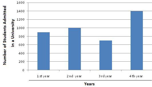 .
.
.Solution
I) 3rd year
II) 700
III) Total number of
students admitted in 1st and 2nd year = 900 + 1000 =
1900.
IV) 4th
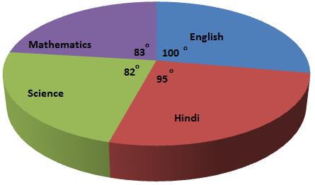
Q4. Marks
obtained by a student in an examination are given below. Draw a pie diagram
representing this information:
Subjects
English
Hindi
Science
Mathematics
Marks
100
95
82
83
Solution
Subjects
Marks
Measure of the central angle
English
100
 Hindi
95
Hindi
95
 Science
82
Science
82
 Mathematics
83
Mathematics
83
 Total
360
360
Total
360
360
Q5. In the given pie chart, the central angle of the sector for vegetarian is:
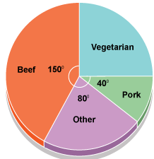
-
1)

-
2)

-
3)

-
4)

Solution
Central angle of the sector for vegetarian

Q6. 85 will not lie in which of the following class intervals?
i. 75-85
ii. 85-95
Solution
In a continuous class interval, the lower limit is included and the upper limit is excluded.
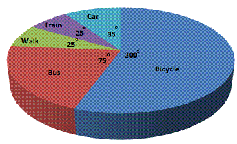
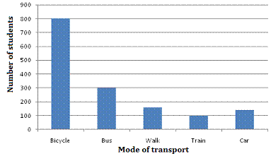
Q7. The following data
give the number of students using different modes of transport:
Mode
of transport
Bicycle
Bus
Walk
Train
Car
Number
of students
800
300
100
100
140
Represent the above
data using a pie diagram.
Solution
Mode of transport
Number of students
Measure of the central angle
Bicycle
800
 Bus
300
Bus
300
 Walk
100
Walk
100
 Train
100
Car
140
Train
100
Car
140
 Total
1440
360
On the basis of the table, the pie
diagram is as shown:
Total
1440
360
On the basis of the table, the pie
diagram is as shown:
Q8. A die is rolled and a coin is tossed, find the probability that the die shows an odd number and the coin shows a head.
Solution
Here, S = { (1,H),(2,H),(3,H),(4,H),(5,H),(6,H),(1,T),(2,T),(3,T),(4,T),(5,T),(6,T)}
Let E be the event "the die shows an odd number and the coin shows a head".
Therefore,
E={(1,H),(3,H),(5,H)}

Q9. The pie chart given below shows the subjects liked by students of class VIII of a school. What percentage of students like Maths?
Solution

Q10.
Two dice are tossed. The probability that the total score is a prime number is:
Solution
Clearly,
n(S) = (6 x 6) = 36.
Let E = Event that the sum is a prime number.
Then E = {(1, 1), (1, 2), (1, 4), (1, 6), (2, 1), (2, 3), (2, 5), (3, 2),
(3, 4), (4, 1), (4, 3),
(5, 2), (5, 6), (6, 1), (6, 5) }

Q11. The following pie-chart shows the percentage distribution of the expenditure incurred in publishing a book. Study the pie-chart and the answer the questions based on it.
 i) If for a certain quantity of books, the publisher has to pay Rs. 30,600 as printing cost, than what will be amount of royalty to be paid for these books?
ii) What is the central angle of the sector corresponding to the expenditure incurred on Royalty?
i) If for a certain quantity of books, the publisher has to pay Rs. 30,600 as printing cost, than what will be amount of royalty to be paid for these books?
ii) What is the central angle of the sector corresponding to the expenditure incurred on Royalty?
i) If for a certain quantity of books, the publisher has to pay Rs. 30,600 as printing cost, than what will be amount of royalty to be paid for these books?
ii) What is the central angle of the sector corresponding to the expenditure incurred on Royalty?Solution
i) Let the amount of Royalty to be paid for these books is Rs. r.
Then, 20:15 = 30600:r
 ii) Central angle corresponding to Royalty = 15% of 360

Q12.  The bar graph shows the marks Brett obtained in his end of year exams. i) How many more percentage points did Brett score in his best subject than in his worst subject?
ii) Brett's friend, Luke, scored 12 percentage points higher than Brett in Science. What was Luke's marks for Science?
The bar graph shows the marks Brett obtained in his end of year exams. i) How many more percentage points did Brett score in his best subject than in his worst subject?
ii) Brett's friend, Luke, scored 12 percentage points higher than Brett in Science. What was Luke's marks for Science?
The bar graph shows the marks Brett obtained in his end of year exams. i) How many more percentage points did Brett score in his best subject than in his worst subject?
ii) Brett's friend, Luke, scored 12 percentage points higher than Brett in Science. What was Luke's marks for Science?
Solution
i) Brett's best subject was English, in which he scored 60%. Brett's worst subject was Geography, in which he scored 25%. Therefore, he scored (60 - 25)% = 35% more in his best subject than in his worst subject.
ii) Brett's mark in Science was 42% Therefore, Luke's mark in Science was 42% + 12% = 54%
Q13. The following table
shows various modes of transport used by 1500 students of a school.
Mode
of transport
Bicycle
Bus
Walk
Train
Car
Number
of students
800
300
160
100
140
Draw a bar graph to
represent the above data.
Solution
Q14. The following data represent scores of 50 students in a calculus test. 72 72 93 70 59 78 74 65 73 80 57 67 72 57 83 76 74 56 68 67 74 76 79 72 61 72 73 76 67 49 71 53 67 65 100 83 69 61 72 68 65 51 75 68 75 66 77 61 64 74 Prepare the continuous grouped frequency distribution table.
Solution

Q15. Read the bar graph
given below and answer the following questions:
I) In which subject is the student poor?
II) What is the average of his marks?
III) In which subject is he very good?
IV) What information does the bar graph
give?

Solution
I) Mathematics
II) Average = 66
III) Hindi
IV) The bar graph shows the marks obtained by a student
in five subjects.
Q16. Use the given pictograph to answer the following questions.
 (a) How many cookie boxes were sold by Sam?
(b) How many cookie boxes were sold by Emma?
(a) How many cookie boxes were sold by Sam?
(b) How many cookie boxes were sold by Emma?
(a) How many cookie boxes were sold by Sam?
(b) How many cookie boxes were sold by Emma?Solution
(a) Number of cookie boxes sold by Sam = 7 x 5 = 35
(b) Number of cookie boxes sold by Emma = 3 x 5 = 15.
Q17. A survey was conducted to know the numbers of cars, buses and motorcycles that passes a particular junction. The result is depicted by the given pie chart. There were 150 buses in the survey.
 a) What fraction of the vehicles were motorcycles?
b) What percentage of vehicles passing by the junction were cars?
c) Calculate the total number of vehicles in the survey.
d) How many cars were included in the survey?
a) What fraction of the vehicles were motorcycles?
b) What percentage of vehicles passing by the junction were cars?
c) Calculate the total number of vehicles in the survey.
d) How many cars were included in the survey?
a) What fraction of the vehicles were motorcycles?
b) What percentage of vehicles passing by the junction were cars?
c) Calculate the total number of vehicles in the survey.
d) How many cars were included in the survey?Solution
a) Fraction of motorcycles
 b) To convert the angle of a sector into a percentage, we use the formula:
Percentage
b) To convert the angle of a sector into a percentage, we use the formula:
Percentage  Percentage of cars
  c) Let x be the total number of vehicles
 The total number of vehicles is 1,800
d) Number of cars
The total number of vehicles is 1,800
d) Number of cars 
The total number of vehicles is 1,800
d) Number of cars
Q18. The given pictograph shows rainfall (in cm) in different cities named (A, B, C, D, E and F) during the current year. On the basis of this pictograph, answer the following questions.
 1. In which city was the rainfall maximum?
2. In which city was the rainfall minimum?
3. The city A recorded how much more rainfall than the city F?
1. In which city was the rainfall maximum?
2. In which city was the rainfall minimum?
3. The city A recorded how much more rainfall than the city F?
1. In which city was the rainfall maximum?
2. In which city was the rainfall minimum?
3. The city A recorded how much more rainfall than the city F? Solution
1. Maximum rainfall occurred in city B.
2. Minimum rainfall occurred in city F.
3. Rainfall in city A = 7 x 25 cm = 175 cm
Rainfall in city F = 1 x 25 cm = 25 cm
Difference between rainfalls of city A and F = 175 cm - 25 cm = 150 cm.
Thus, city A recorded 150 cm more rainfall than city F.
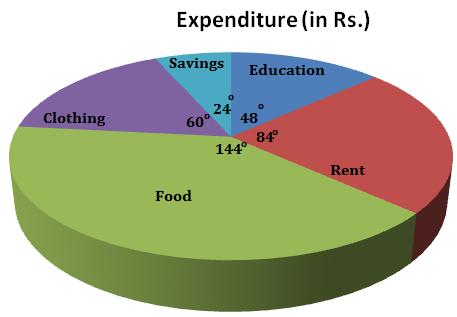
Q19. The monthly income of
a family is Rs. 15000. The monthly expenditure of the family on various items
is given below.
Items
Education
Rent
Food
Clothing
Savings
Expenditure
(in
Rs.)
2000
3500
6000
2500
1000
Represent the above
data using a pie diagram.
Solution
Items
Expenditure
(in Rs.)
Measure of the central angle
Education
2000
 Rent
3500
Rent
3500
 Food
6000
Food
6000
 Clothing
2500
Clothing
2500
 Savings
1000
Savings
1000
 Total
15000
360
On the basis of the table, the pie
diagram is as shown:
Total
15000
360
On the basis of the table, the pie
diagram is as shown:
Comments
Post a Comment